Atlassian's Confluence is a powerful collaborative tool for teams to track information and content that may not make sense on a Jira ticket. One of the most powerful pieces of functionality in Confluence is the ability to use templates. While there are many templates provided out of the box, you also have the ability to create your own templates either globally or at the space level. Today we'll focus on creating a space template, and show you a few tips to get you started. Let's walk through some basics so you can hit the ground running on a space template.
Creating a Space Template
Before we talk about best practices, here's a quick overview on creating a space template.
The required permissions for creating a space template are Space administrator
or Confluence administrator
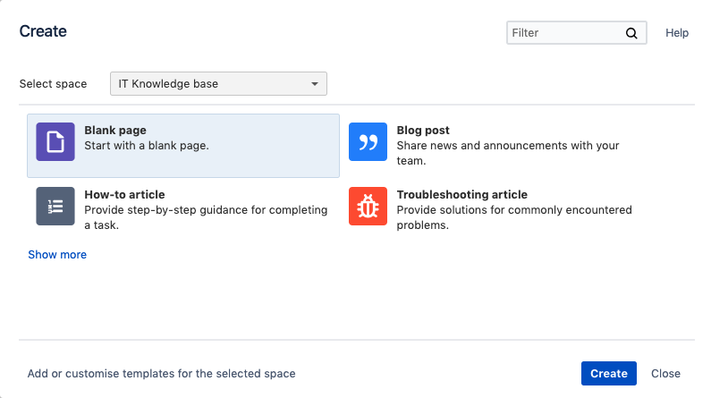
An easy way to get to your space templates is to select the plus sign on the left navigation while viewing the space where you'd like to create the template.
![]()
Then simply select "Add or customize templates for the selected space" and it will bring you to the space administration page to work on your template.

Getting Started
Confluence is a great collaborative tool for sharing information, and templates should be used to make sharing that information easier. When creating your templates a good best practice is to start with the end in mind. When a page is created from the template, the page should be easy to read and the most important information should stand out.
Now that you've got a blank template in front of you, think about how you want it to be used:
- What is most important about this page?
- What info do we need to share/display?
- Who is the intended audience?
- Where would you expect to find the info you are looking for?
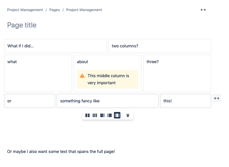
Once you've considered the above, we recommend starting with the layout. The template can be very easily organized using the page layout to space out information differently. Creating sections in the layout to divide up the information can be helpful when starting. You might end up combining some of the sections in the future, but this will give you some buckets to start sorting information into. On a similar note, we also have the Panel macro at our disposal. The panel macro provides a visible container for the information, and allows you to use color coded boxes and icons to call out specific information on the page.

Once you've sorted the information into sections, you can start guiding the user on how to fill out the template. We like to do this by using placeholder text. Placeholder text is only visible while editing the page created from the template, and can be used to provide tips to users (how to insert a macro, for example), or act as more detailed guidance on the purpose of the page.
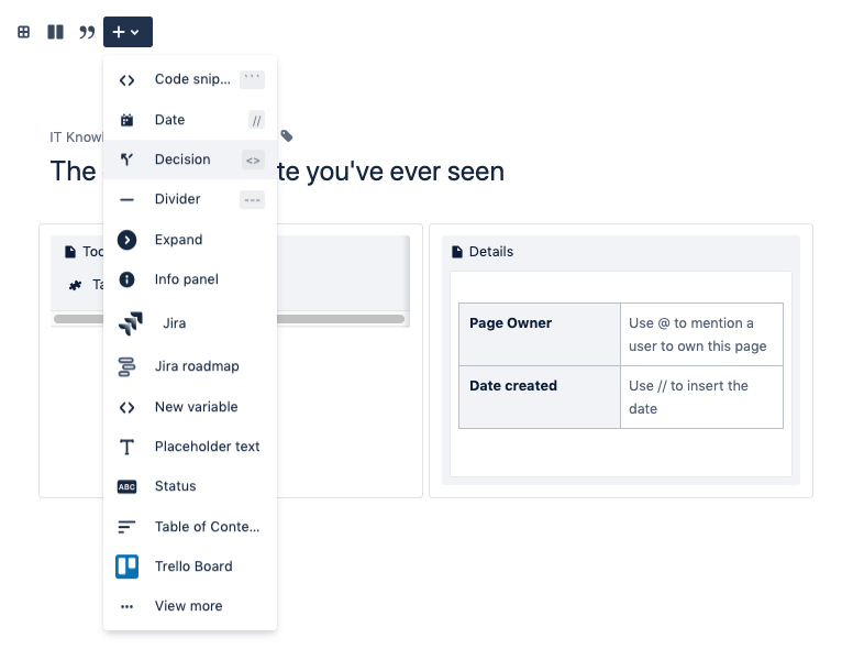
Placeholder text can be added by selecting the + sign in the template editor, and selecting Placeholder text. Once inserted, it will appear as grey text, as we see on the right side of the page.
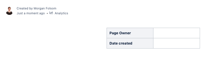
 Below you can see what that same page looks like when published - the placeholder text doesn't appear at all.

Now what do I do?
The hardest part is over - you don't have a blank page anymore! Now you can explore things like macros, tables and labels to spice up the template even more. If your team is working with Jira data, don't forget you can use a Jira Issues macro to display it in Confluence. If you need to think bigger, check out our article, Five Ways to Make a Collaborative Team Space in Confluence.
And if you still have any questions on anything Confluence or Jira, or want to find out how to make your company the best version of itself, contact us, and one of our experts will get in touch!

